Hinweis
Zum Ende springen, um den vollständigen Beispielcode herunterzuladen.
Leistungs-/Frequenzdichte (PSD)#
Darstellung der Leistungs-/Frequenzdichte (PSD) unter Verwendung von psd.
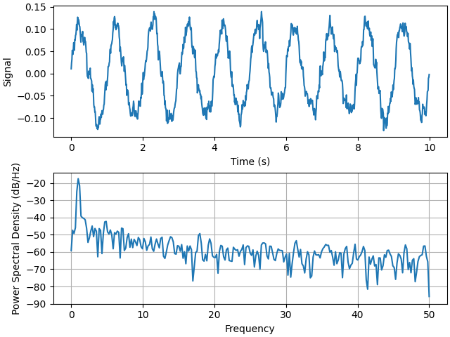
Die PSD ist eine gängige Darstellung im Bereich der Signalverarbeitung. NumPy bietet viele nützliche Bibliotheken zur Berechnung einer PSD. Nachfolgend zeigen wir einige Beispiele, wie dies mit Matplotlib erreicht und visualisiert werden kann.
import matplotlib.pyplot as plt
import numpy as np

import matplotlib.mlab as mlab

# Fixing random state for reproducibility
np.random.seed(19680801)

dt = 0.01
t = np.arange(0, 10, dt)
nse = np.random.randn(len(t))
r = np.exp(-t / 0.05)

cnse = np.convolve(nse, r) * dt
cnse = cnse[:len(t)]
s = 0.1 * np.sin(2 * np.pi * t) + cnse

fig, (ax0, ax1) = plt.subplots(2, 1, layout='constrained')
ax0.plot(t, s)
ax0.set_xlabel('Time (s)')
ax0.set_ylabel('Signal')
ax1.psd(s, NFFT=512, Fs=1 / dt)

plt.show()
Vergleichen Sie dies mit dem äquivalenten Matlab-Code, um dasselbe zu erreichen
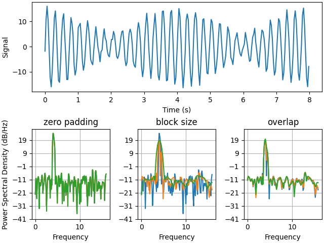
Nachfolgend zeigen wir ein etwas komplexeres Beispiel, das demonstriert, wie sich Padding auf die resultierende PSD auswirkt.
dt = np.pi / 100.
fs = 1. / dt
t = np.arange(0, 8, dt)
y = 10. * np.sin(2 * np.pi * 4 * t) + 5. * np.sin(2 * np.pi * 4.25 * t)
y = y + np.random.randn(*t.shape)

# Plot the raw time series
fig, axs = plt.subplot_mosaic([
    ['signal', 'signal', 'signal'],
    ['zero padding', 'block size', 'overlap'],
], layout='constrained')

axs['signal'].plot(t, y)
axs['signal'].set_xlabel('Time (s)')
axs['signal'].set_ylabel('Signal')

# Plot the PSD with different amounts of zero padding. This uses the entire
# time series at once
axs['zero padding'].psd(y, NFFT=len(t), pad_to=len(t), Fs=fs)
axs['zero padding'].psd(y, NFFT=len(t), pad_to=len(t) * 2, Fs=fs)
axs['zero padding'].psd(y, NFFT=len(t), pad_to=len(t) * 4, Fs=fs)

# Plot the PSD with different block sizes, Zero pad to the length of the
# original data sequence.
axs['block size'].psd(y, NFFT=len(t), pad_to=len(t), Fs=fs)
axs['block size'].psd(y, NFFT=len(t) // 2, pad_to=len(t), Fs=fs)
axs['block size'].psd(y, NFFT=len(t) // 4, pad_to=len(t), Fs=fs)
axs['block size'].set_ylabel('')

# Plot the PSD with different amounts of overlap between blocks
axs['overlap'].psd(y, NFFT=len(t) // 2, pad_to=len(t), noverlap=0, Fs=fs)
axs['overlap'].psd(y, NFFT=len(t) // 2, pad_to=len(t),
                   noverlap=int(0.025 * len(t)), Fs=fs)
axs['overlap'].psd(y, NFFT=len(t) // 2, pad_to=len(t),
                   noverlap=int(0.1 * len(t)), Fs=fs)
axs['overlap'].set_ylabel('')
axs['overlap'].set_title('overlap')

for title, ax in axs.items():
    if title == 'signal':
        continue

    ax.set_title(title)
    ax.sharex(axs['zero padding'])
    ax.sharey(axs['zero padding'])

plt.show()
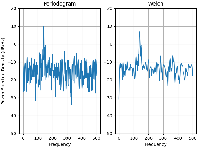
Dies ist eine portierte Version eines MATLAB-Beispiels aus dem Signal Processing Toolbox, das zu einer Zeit einige Unterschiede zwischen der Skalierung der PSD in Matplotlib und MATLAB zeigte.
fs = 1000
t = np.linspace(0, 0.3, 301)
A = np.array([2, 8]).reshape(-1, 1)
f = np.array([150, 140]).reshape(-1, 1)
xn = (A * np.sin(2 * np.pi * f * t)).sum(axis=0)
xn += 5 * np.random.randn(*t.shape)

fig, (ax0, ax1) = plt.subplots(ncols=2, layout='constrained')

yticks = np.arange(-50, 30, 10)
yrange = (yticks[0], yticks[-1])
xticks = np.arange(0, 550, 100)

ax0.psd(xn, NFFT=301, Fs=fs, window=mlab.window_none, pad_to=1024,
        scale_by_freq=True)
ax0.set_title('Periodogram')
ax0.set_yticks(yticks)
ax0.set_xticks(xticks)
ax0.grid(True)
ax0.set_ylim(yrange)

ax1.psd(xn, NFFT=150, Fs=fs, window=mlab.window_none, pad_to=512, noverlap=75,
        scale_by_freq=True)
ax1.set_title('Welch')
ax1.set_xticks(xticks)
ax1.set_yticks(yticks)
ax1.set_ylabel('')  # overwrite the y-label added by `psd`
ax1.grid(True)
ax1.set_ylim(yrange)

plt.show()
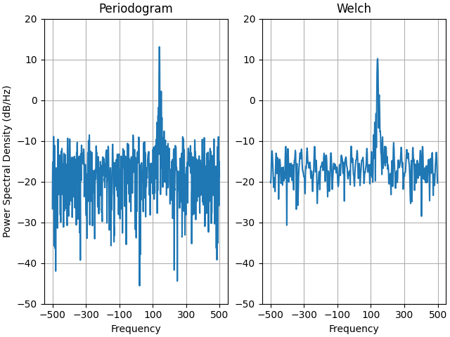
Dies ist eine portierte Version eines MATLAB-Beispiels aus dem Signal Processing Toolbox, das zu einer Zeit einige Unterschiede zwischen der Skalierung der PSD in Matplotlib und MATLAB zeigte.
Es verwendet ein komplexes Signal, damit wir sehen können, dass komplexe PSDs ordnungsgemäß funktionieren.
prng = np.random.RandomState(19680801)  # to ensure reproducibility

fs = 1000
t = np.linspace(0, 0.3, 301)
A = np.array([2, 8]).reshape(-1, 1)
f = np.array([150, 140]).reshape(-1, 1)
xn = (A * np.exp(2j * np.pi * f * t)).sum(axis=0) + 5 * prng.randn(*t.shape)

fig, (ax0, ax1) = plt.subplots(ncols=2, layout='constrained')

yticks = np.arange(-50, 30, 10)
yrange = (yticks[0], yticks[-1])
xticks = np.arange(-500, 550, 200)

ax0.psd(xn, NFFT=301, Fs=fs, window=mlab.window_none, pad_to=1024,
        scale_by_freq=True)
ax0.set_title('Periodogram')
ax0.set_yticks(yticks)
ax0.set_xticks(xticks)
ax0.grid(True)
ax0.set_ylim(yrange)

ax1.psd(xn, NFFT=150, Fs=fs, window=mlab.window_none, pad_to=512, noverlap=75,
        scale_by_freq=True)
ax1.set_title('Welch')
ax1.set_xticks(xticks)
ax1.set_yticks(yticks)
ax1.set_ylabel('')  # overwrite the y-label added by `psd`
ax1.grid(True)
ax1.set_ylim(yrange)

plt.show()
Gesamtlaufzeit des Skripts: (0 Minuten 5,048 Sekunden)