Hinweis
Gehen Sie zum Ende, um den vollständigen Beispielcode herunterzuladen.
Colormap-Normalisierungen#
Demonstration der Verwendung von Norm zur nichtlinearen Abbildung von Colormaps auf Daten.
import matplotlib.pyplot as plt
import numpy as np

import matplotlib.colors as colors

N = 100
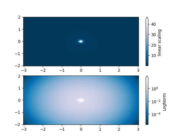
LogNorm#
Diese Beispieldaten haben einen niedrigen Buckel mit einer Spitze in der Mitte. Wenn sie mit einer linearen Farbskala geplottet werden, ist nur die Spitze sichtbar. Um sowohl den Buckel als auch die Spitze zu sehen, ist die z/Farb-Achse auf einer logarithmischen Skala erforderlich.
Anstatt die Daten mit pcolor(log10(Z)) zu transformieren, kann die Farbabbildung mit einer LogNorm logarithmisch gemacht werden.
X, Y = np.mgrid[-3:3:complex(0, N), -2:2:complex(0, N)]
Z1 = np.exp(-X**2 - Y**2)
Z2 = np.exp(-(X * 10)**2 - (Y * 10)**2)
Z = Z1 + 50 * Z2

fig, ax = plt.subplots(2, 1)

pcm = ax[0].pcolor(X, Y, Z, cmap='PuBu_r', shading='nearest')
fig.colorbar(pcm, ax=ax[0], extend='max', label='linear scaling')

pcm = ax[1].pcolor(X, Y, Z, cmap='PuBu_r', shading='nearest',
                   norm=colors.LogNorm(vmin=Z.min(), vmax=Z.max()))
fig.colorbar(pcm, ax=ax[1], extend='max', label='LogNorm')
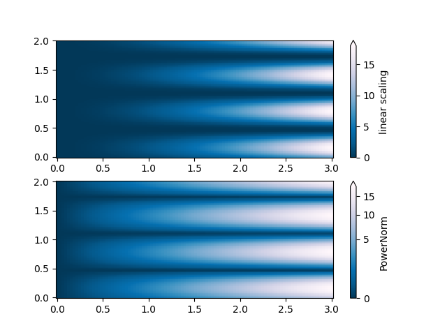
PowerNorm#
Diese Beispieldaten mischen einen Potenzgesetz-Trend in X mit einer gleichgerichteten Sinuswelle in Y. Wenn sie mit einer linearen Farbskala geplottet werden, verdeckt der Potenzgesetz-Trend in X teilweise die Sinuswelle in Y.
Das Potenzgesetz kann mit einer PowerNorm entfernt werden.
X, Y = np.mgrid[0:3:complex(0, N), 0:2:complex(0, N)]
Z = (1 + np.sin(Y * 10)) * X**2

fig, ax = plt.subplots(2, 1)

pcm = ax[0].pcolormesh(X, Y, Z, cmap='PuBu_r', shading='nearest')
fig.colorbar(pcm, ax=ax[0], extend='max', label='linear scaling')

pcm = ax[1].pcolormesh(X, Y, Z, cmap='PuBu_r', shading='nearest',
                       norm=colors.PowerNorm(gamma=0.5))
fig.colorbar(pcm, ax=ax[1], extend='max', label='PowerNorm')
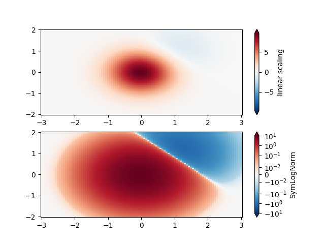
SymLogNorm#
Diese Beispieldaten haben zwei Buckel, einen negativen und einen positiven. Der positive Buckel hat die fünffache Amplitude des negativen. Wenn sie mit einer linearen Farbskala geplottet werden, ist das Detail im negativen Buckel verdeckt.
Hier skalieren wir die positiven und negativen Daten logarithmisch separat mit SymLogNorm.
Beachten Sie, dass die Farbbarren-Beschriftungen nicht sehr gut aussehen.
X, Y = np.mgrid[-3:3:complex(0, N), -2:2:complex(0, N)]
Z1 = np.exp(-X**2 - Y**2)
Z2 = np.exp(-(X - 1)**2 - (Y - 1)**2)
Z = (5 * Z1 - Z2) * 2

fig, ax = plt.subplots(2, 1)

pcm = ax[0].pcolormesh(X, Y, Z, cmap='RdBu_r', shading='nearest',
                       vmin=-np.max(Z))
fig.colorbar(pcm, ax=ax[0], extend='both', label='linear scaling')

pcm = ax[1].pcolormesh(X, Y, Z, cmap='RdBu_r', shading='nearest',
                       norm=colors.SymLogNorm(linthresh=0.015,
                                              vmin=-10.0, vmax=10.0, base=10))
fig.colorbar(pcm, ax=ax[1], extend='both', label='SymLogNorm')
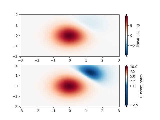
Benutzerdefinierte Norm#
Alternativ können die obigen Beispieldaten mit einer angepassten Normalisierung skaliert werden. Diese hier normalisiert die negativen Daten anders als die positiven.
# Example of making your own norm.  Also see matplotlib.colors.
# From Joe Kington: This one gives two different linear ramps:
class MidpointNormalize(colors.Normalize):
    def __init__(self, vmin=None, vmax=None, midpoint=None, clip=False):
        self.midpoint = midpoint
        super().__init__(vmin, vmax, clip)

    def __call__(self, value, clip=None):
        # I'm ignoring masked values and all kinds of edge cases to make a
        # simple example...
        x, y = [self.vmin, self.midpoint, self.vmax], [0, 0.5, 1]
        return np.ma.masked_array(np.interp(value, x, y))
fig, ax = plt.subplots(2, 1)

pcm = ax[0].pcolormesh(X, Y, Z, cmap='RdBu_r', shading='nearest',
                       vmin=-np.max(Z))
fig.colorbar(pcm, ax=ax[0], extend='both', label='linear scaling')

pcm = ax[1].pcolormesh(X, Y, Z, cmap='RdBu_r', shading='nearest',
                       norm=MidpointNormalize(midpoint=0))
fig.colorbar(pcm, ax=ax[1], extend='both', label='Custom norm')
BoundaryNorm#
Für die beliebige Aufteilung der Farbskala kann die BoundaryNorm verwendet werden; durch Angabe der Grenzen für die Farben legt diese Norm die erste Farbe zwischen dem ersten Paar, die zweite Farbe zwischen dem zweiten Paar usw. ab.
fig, ax = plt.subplots(3, 1, layout='constrained')

pcm = ax[0].pcolormesh(X, Y, Z, cmap='RdBu_r', shading='nearest',
                       vmin=-np.max(Z))
fig.colorbar(pcm, ax=ax[0], extend='both', orientation='vertical',
             label='linear scaling')

# Evenly-spaced bounds gives a contour-like effect.
bounds = np.linspace(-2, 2, 11)
norm = colors.BoundaryNorm(boundaries=bounds, ncolors=256)
pcm = ax[1].pcolormesh(X, Y, Z, cmap='RdBu_r', shading='nearest',
                       norm=norm)
fig.colorbar(pcm, ax=ax[1], extend='both', orientation='vertical',
             label='BoundaryNorm\nlinspace(-2, 2, 11)')

# Unevenly-spaced bounds changes the colormapping.
bounds = np.array([-1, -0.5, 0, 2.5, 5])
norm = colors.BoundaryNorm(boundaries=bounds, ncolors=256)
pcm = ax[2].pcolormesh(X, Y, Z, cmap='RdBu_r', shading='nearest',
                       norm=norm)
fig.colorbar(pcm, ax=ax[2], extend='both', orientation='vertical',
             label='BoundaryNorm\n[-1, -0.5, 0, 2.5, 5]')

plt.show()

Gesamtlaufzeit des Skripts: (0 Minuten 8,297 Sekunden)