Hinweis
Zum Ende springen, um den vollständigen Beispielcode herunterzuladen.
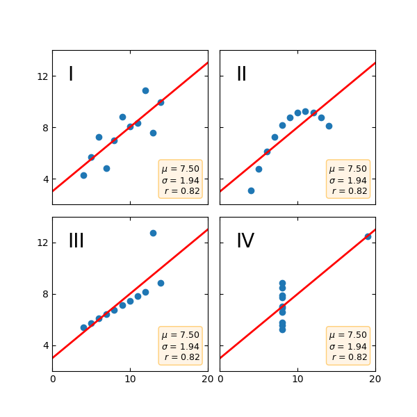
Anscombe's Quartett#
Anscombe's Quartett ist eine Gruppe von Datensätzen (x, y), die denselben Mittelwert, dieselbe Standardabweichung und dieselbe Regressionsgerade aufweisen, aber qualitativ unterschiedlich sind.
Es wird oft verwendet, um die Bedeutung der grafischen Betrachtung eines Datensatzes zu veranschaulichen und sich nicht nur auf grundlegende statistische Eigenschaften zu verlassen.
import matplotlib.pyplot as plt
import numpy as np

x = [10, 8, 13, 9, 11, 14, 6, 4, 12, 7, 5]
y1 = [8.04, 6.95, 7.58, 8.81, 8.33, 9.96, 7.24, 4.26, 10.84, 4.82, 5.68]
y2 = [9.14, 8.14, 8.74, 8.77, 9.26, 8.10, 6.13, 3.10, 9.13, 7.26, 4.74]
y3 = [7.46, 6.77, 12.74, 7.11, 7.81, 8.84, 6.08, 5.39, 8.15, 6.42, 5.73]
x4 = [8, 8, 8, 8, 8, 8, 8, 19, 8, 8, 8]
y4 = [6.58, 5.76, 7.71, 8.84, 8.47, 7.04, 5.25, 12.50, 5.56, 7.91, 6.89]

datasets = {
    'I': (x, y1),
    'II': (x, y2),
    'III': (x, y3),
    'IV': (x4, y4)
}

fig, axs = plt.subplots(2, 2, sharex=True, sharey=True, figsize=(6, 6),
                        gridspec_kw={'wspace': 0.08, 'hspace': 0.08})
axs[0, 0].set(xlim=(0, 20), ylim=(2, 14))
axs[0, 0].set(xticks=(0, 10, 20), yticks=(4, 8, 12))

for ax, (label, (x, y)) in zip(axs.flat, datasets.items()):
    ax.text(0.1, 0.9, label, fontsize=20, transform=ax.transAxes, va='top')
    ax.tick_params(direction='in', top=True, right=True)
    ax.plot(x, y, 'o')

    # linear regression
    p1, p0 = np.polyfit(x, y, deg=1)  # slope, intercept
    ax.axline(xy1=(0, p0), slope=p1, color='r', lw=2)

    # add text box for the statistics
    stats = (f'$\\mu$ = {np.mean(y):.2f}\n'
             f'$\\sigma$ = {np.std(y):.2f}\n'
             f'$r$ = {np.corrcoef(x, y)[0][1]:.2f}')
    bbox = dict(boxstyle='round', fc='blanchedalmond', ec='orange', alpha=0.5)
    ax.text(0.95, 0.07, stats, fontsize=9, bbox=bbox,
            transform=ax.transAxes, horizontalalignment='right')

plt.show()
Referenzen
Die Verwendung der folgenden Funktionen, Methoden, Klassen und Module wird in diesem Beispiel gezeigt
matplotlib.axes.Axes.tick_params/ matplotlib.pyplot.tick_params`